Web Design
Otio.ai
Project Overview
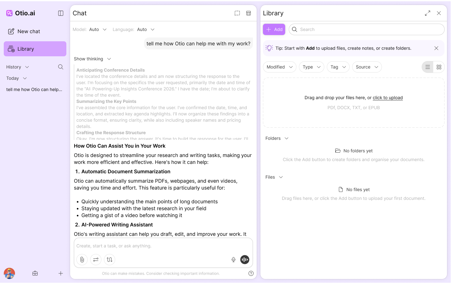
Otio is an AI-powered knowledge library that lets users upload files, organise them, and chat with their documents. I led the end-to-end design of Otio V2 project to improve subscription conversion and reduce churn, using a UX audit, Hotjar/analytics insights, user surveys, competitor research, and team workshops to prioritise and iterate on a clearer, more intuitive experience.
The Problem
Subscription growth was underperforming and churn was rising. Behaviour data and user feedback showed that users struggled to reach value quickly due to friction in key flows, unclear guidance, and a scattered experience. The product needed simplification and stronger prioritisation—without adding more complexity.
Goal
Create a more intuitive experience that helps users reach value faster, improves the conversion journey, and reduces churn by removing key friction points. Align the V2 feature set with real user needs and technical feasibility through research, prioritisation, and iterative design.
End-to-end owner for the V2 design.
User Research
To understand why Otio was not converting and retaining as expected, I started by defining what users were truly hiring the product for. Otio is an AI knowledge library where users upload documents, organise them, and chat with their files to get answers and insights. When subscription growth slowed and churn increased, I focused on one question: why were users not reaching value fast enough.
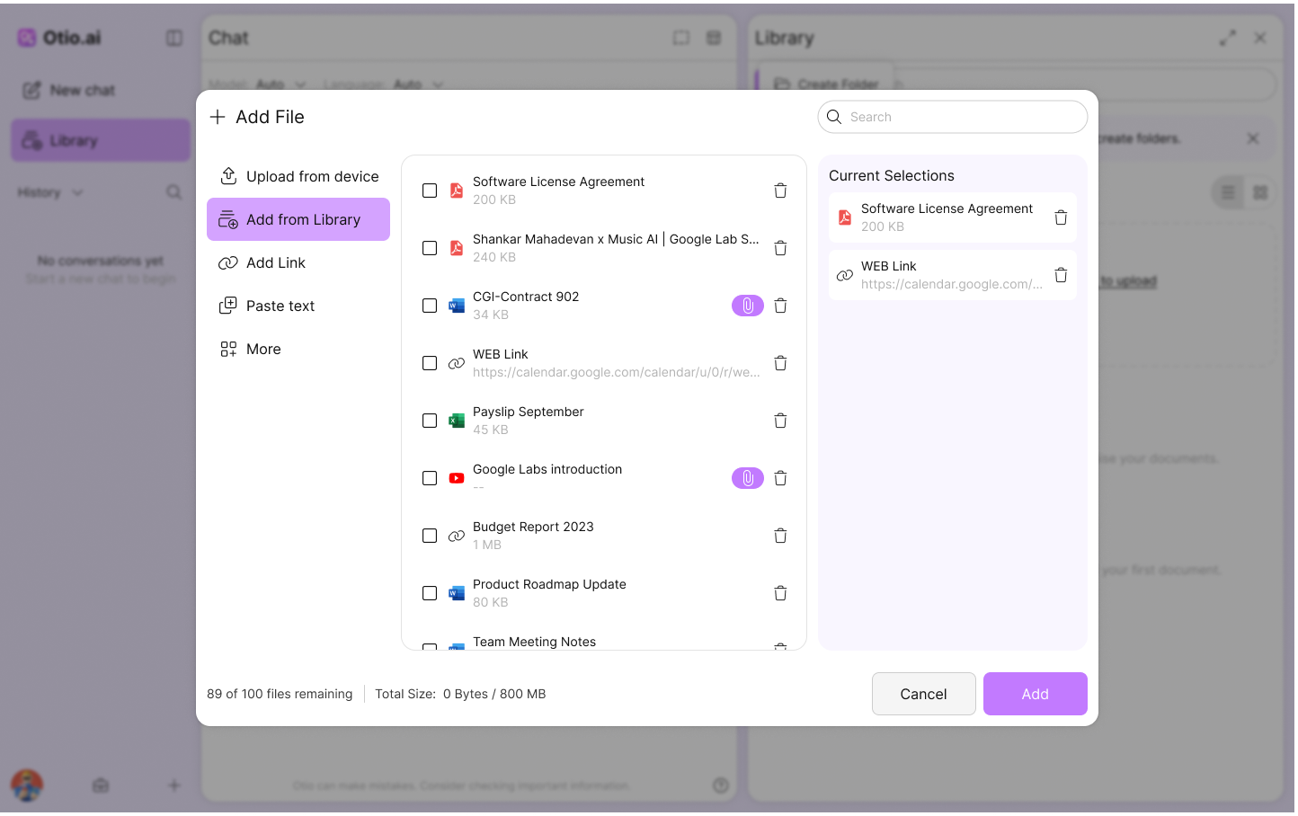
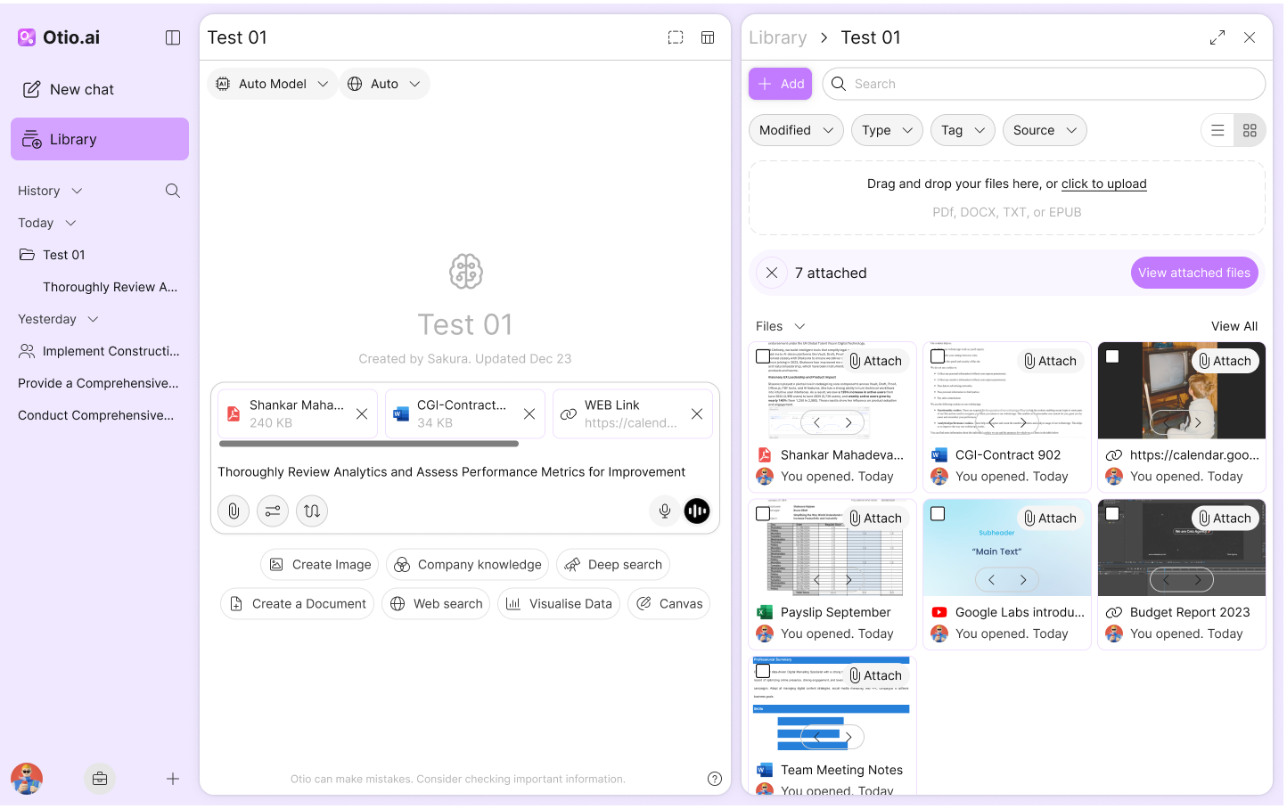
I paired Hotjar and analytics with FigJam discovery to map the jobs users hired Otio for, the steps they took, and where they got stuck. The pattern was consistent across segments. Uploading was easy, but the next step was not always clear. Users wanted a guided path from upload to useful output, with stronger trust in answers and clearer control of sources. The biggest opportunities were simplifying the handoff between Chat, Library, and Workflows, and improving multi document reliability for research heavy users.
UI/UX Audit
%20(1).png)
User Flow
.png)
Competitor Research
Once I understood where users were getting stuck in Otio, I zoomed out to see what “good” looked like in the market and where we were falling behind. I reviewed and audited a set of adjacent tools across AI research, knowledge work, and document based workflows, including products like NotebookLM, Perplexity, Context.ai, You.com, Paperguide, Manus, Notion, Google Drive, and Adobe Acrobat.I captured everything in one place so we could compare them consistently. For each competitor, I documented their core flow, how they onboard new users, how they handle file upload and organisation, and how they position chat alongside documents. I also mapped the features that made their experiences feel faster, clearer, or more trustworthy, and highlighted gaps where Otio could differentiate.To turn research into action, I ran a workshop with the co founder and engineering team. We reviewed the competitor findings, cross checked them against our user jobs and constraints, and used that session to validate which V2 features were worth building. The workshop helped us move from a long list of ideas to a focused V2 scope that matched user needs, supported feasibility, and strengthened the subscription story.


User Persona

This user works with multiple reports and needs to produce a clean summary for teammates. They use Otio to upload sources, ask questions across them, and export a structured output. Their success depends on speed, traceability, and the ability to reference evidence.
Pain points
- Hard to reference exact passages across document
- Collaboration introduces uncertainty around what others can access
- Switching between reading, notes, and chat can feel disconnected
Goals
- Extract insights across multiple documents
- Keep notes linked to specific sources
- Export a clear summary for others
Low-Fidelity
After aligning on user jobs, pain points, and the V2 scope, I moved into low fidelity exploration to test direction quickly without getting stuck in visual detail. I created several lo fi screen sets that each represented a different approach to the same core workflow, focusing on layout, information hierarchy, and how users move between Library, Chat, and key actions.
To validate the direction, I turned these flows into clickable prototypes and ran a workshop with the co founder and engineering team. We walked through each approach, compared trade offs, and used the session to agree on what felt most intuitive, feasible, and aligned with the V2 priorities. The workshop gave us a clear path forward before moving into higher fidelity design.

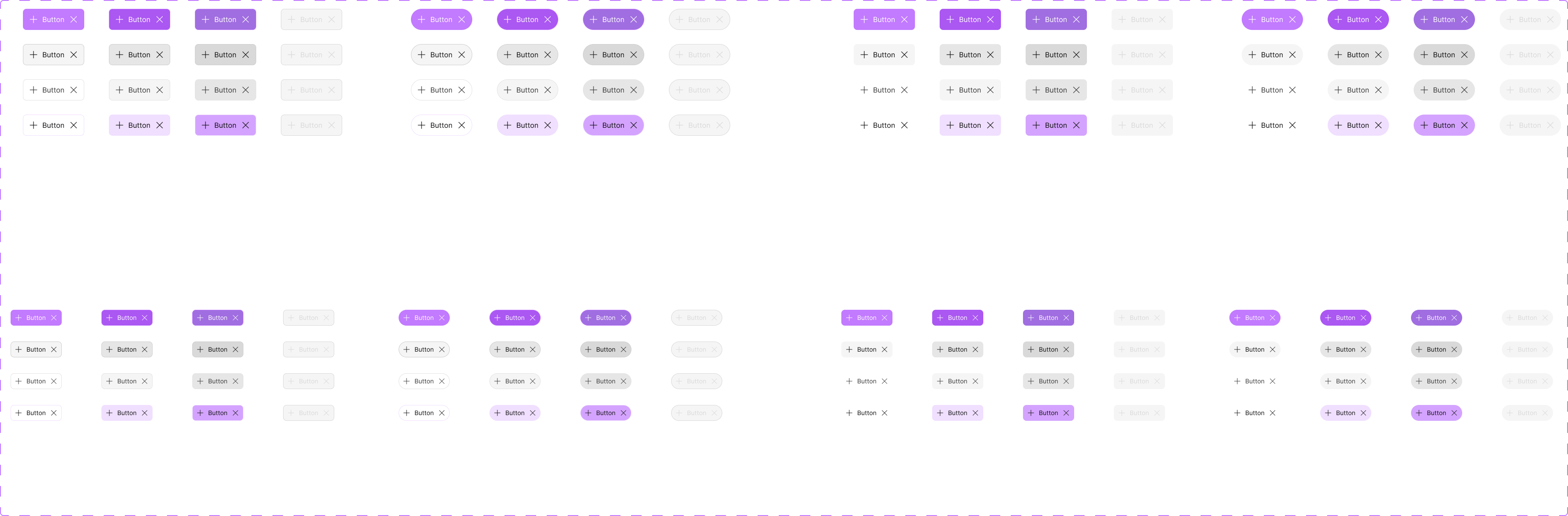
Design System
To ship V2 faster and keep the experience consistent, I created Otio’s design system from scratch. I defined the foundations first, including colour tokens for light and dark mode, typography, spacing, and icons. Then I built and documented reusable components such as buttons, chat elements, panels, and file upload patterns. This gave the team a shared language, reduced UI drift, and made V2 feel more cohesive and easier to use.

Visual Design

LET’S WORK TOGETHER
Email: Rajaeeshakoora@gmail.com


